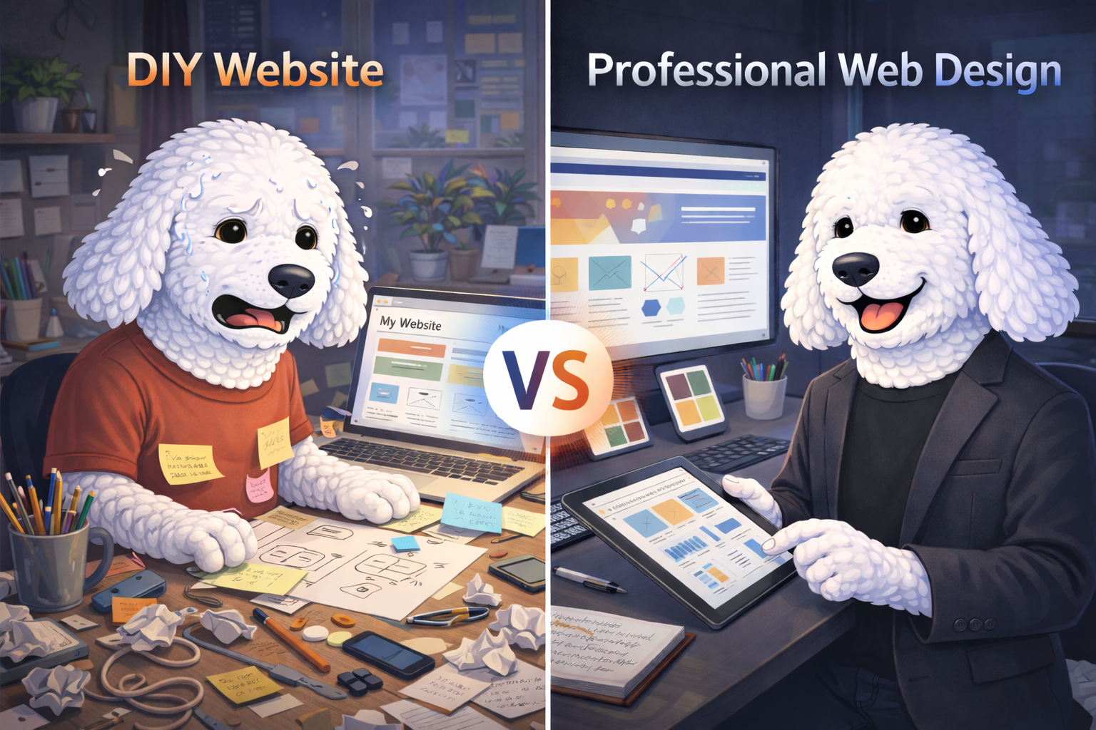
Your Brand Identity Isn't Just Aesthetic. It's Psychological.
Here's something most business owners get wrong about branding: they think it's about making things "look nice."
Pick some colors you like. Choose a font that feels right. Slap a logo together. Done.
Except it's not done. Not even close.
Your brand identity (the colors, the typography, the logo) isn't decoration. It's communication. Every visual choice you make sends a psychological signal to the people you're trying to reach. And the research on this isn't vague marketing fluff. It's backed by neuroscience, cognitive psychology, and peer-reviewed academic studies.
So let's talk about what's actually happening in your customer's brain when they see your brand, and how to make those milliseconds count.
Part 1: Color Psychology: The Science Behind the Palette
You Have 90 Seconds. Color Uses 90% of Them.
Research published in the Journal of Marketing & Social Research (Gupta et al., 2025) found that consumers form initial judgments about a product within 90 seconds of first seeing it, and up to 90% of that assessment is based on color alone. That's not opinion. That's data.
Think about what that means for your business. Before someone reads your tagline, scrolls your homepage, or checks your reviews, they've already formed a feeling about your brand based on color.
Color Drives Recognition, Trust, and Revenue
The numbers from recent research are striking:
- Color increases brand recognition by up to 80% (Straits Research, 2025)
- 85% of consumers say color is the primary reason they choose one product over another
- 93% of consumers evaluate new products based on visual appearance first
- Color advertisements are read 42% more often than the same ads in black and white
This isn't a coincidence. Color activates the limbic system, the part of your brain that governs emotion, memory, and decision-making. When you see a color, your brain doesn't just process it visually. It feels something. And that feeling shapes every interaction that follows.
What the Colors Actually Signal
While color associations are nuanced and context-dependent, research consistently identifies core psychological patterns:
- Blue: Trust, stability, competence. Used by 33% of the world's top brands (Facebook, IBM, LinkedIn). Financial and tech companies gravitate here because blue says "you can rely on us."
- Red: Energy, urgency, passion. It accelerates heart rate and creates a sense of immediacy. That's why it dominates food, retail, and entertainment brands.
- Green: Growth, health, balance. It signals natural, sustainable, and wellness-oriented values. The obvious choice for health, fitness, and environmental brands.
- Yellow: Optimism, warmth, attention. It's the most visible color in the spectrum and triggers feelings of happiness, but overuse can signal caution or anxiety.
- Black: Sophistication, power, luxury. It creates a sense of exclusivity and premium quality. High fashion and luxury brands live here.
- Purple: Creativity, wisdom, spirituality. Eye-tracking data from 2026 studies reveals that purple elements in digital ads generate 34% longer fixation times than other colors, suggesting deeper cognitive processing (Jasmine Directory, 2026).
- White: Simplicity, cleanliness, space. It communicates clarity and minimalism, but carries different cultural meanings globally.
The Brand-Color Congruence Effect
Here's where it gets really interesting. Research on color-brand personality congruence shows that it's not just about picking a "good" color. It's about picking the right color for your brand's personality.
When the color matches the brand's identity, consumers respond more positively. When there's a mismatch (say, a children's toy company using all black and gray), consumers feel cognitive dissonance, even if they can't articulate why. The brand just "feels off."
A 2025 study published in the Journal of Consumer Research (Oxford Academic) took this further, examining color saturation and luxury brand perception. The finding? Less saturated colors elevate perceived luxury status because consumers subconsciously associate muted, desaturated tones with the passage of time: fading, aging, heritage. A luxury boutique field study confirmed that consumers were willing to pay higher prices for products in less saturated colors.
The takeaway: your color choices aren't just visual preferences. They're strategic signals that either align with or undermine your brand's positioning.
Culture Changes Everything
One critical note: color psychology is not universal. Research across eight countries found that while some associations remain consistent globally (blue = quality), others shift dramatically. White represents purity in Western cultures but mourning in parts of East Asia. Red signals danger in some contexts but luck and prosperity in Chinese culture.
If your brand operates across cultures, or serves diverse communities, your palette needs to account for this.
Part 2: Typography: The Voice Your Customers Read In
Fonts Have Feelings. Literally.
If color is how your brand feels, typography is how your brand speaks. And the research is clear: the font you choose fundamentally changes how people perceive your message, even when the words are identical.
Monotype's ongoing research program (2021-2025) has been studying the emotional power of typefaces across languages and cultures. Their findings reveal that font choices trigger measurable emotional responses, and those responses vary significantly by geography and cultural context.
A separate finding from recent design psychology research shows that appropriate font choices can increase conversion rates by up to 35%. That's not a design preference. That's revenue.
The Four Font Families and What They Communicate
Serif Fonts (Times New Roman, Garamond, Playfair Display)
- Signal: Tradition, authority, trustworthiness, sophistication
- Research shows consumers subconsciously link serif fonts with credibility and established brands
- Best for: Law firms, financial services, luxury brands, editorial publications
- 2026 trend: Modern serifs are making a comeback: clean, spacious, and surprisingly versatile for brands wanting to feel intelligent and human (Neue World, 2026)
Sans-Serif Fonts (Helvetica, Inter, Montserrat)
- Signal: Modern, clean, approachable, innovative
- Associated with forward-thinking, tech-savvy, and accessible brands
- Best for: Tech companies, startups, health and wellness, modern retail
- Dominates digital because of superior screen readability
Script Fonts (Pacifico, Great Vibes, Dancing Script)
- Signal: Elegance, creativity, personal touch, femininity
- Creates intimacy and handcrafted feeling
- Best for: Beauty, fashion, wedding, artisan brands
- Warning: Overuse or poor execution reads as unprofessional
Display Fonts (Impact, Bebas Neue, Lobster)
- Signal: Bold, attention-grabbing, distinctive
- Used for headlines and statements, never body text
- Best for: Entertainment, sports, food and beverage, youth brands
- The personality fonts: they make a statement but need restraint
Font Pairing Is Brand Strategy
Professional designers don't just pick a font. They build a type system. Typically:
- Primary font: Headlines and brand name (personality-driven)
- Secondary font: Body text and descriptions (readability-driven)
- Accent font: CTAs, quotes, or special elements (sparingly used)
The relationship between fonts matters as much as the individual choices. A serif headline paired with a sans-serif body creates contrast that signals "established but modern." Two sans-serifs together feel clean and unified. A script font paired with a bold sans-serif creates elegant tension.
This isn't arbitrary. It's visual hierarchy, guiding the eye and shaping perception at every level.
Part 3: Logo Design: The Brain's Shortcut to Your Brand
Your Logo Is a Memory Trigger
A 2025 study published in Applied Cognitive Psychology (Wiley) examined how well people actually remember logos. The results were humbling: out of 200 participants, not a single person could accurately reproduce the Google logo from memory, despite seeing it hundreds of times. However, participants performed significantly better in recognition than recall.
What does this mean for your brand? Your logo doesn't need to be memorable in every detail. It needs to be instantly recognizable. Recognition and recall are different cognitive processes, and logos work primarily through recognition: a quick "I know that" signal that triggers all the associations, feelings, and experiences connected to your brand.
That's why consistency matters more than complexity. It takes 5-7 brand impressions before a logo becomes familiar enough to trigger recognition.
Neuroscience Meets Logo Design
A 2025 study published in Behavioral Sciences (MDPI) used advanced neuroscience methods to analyze logo design, including AI-powered eye tracking (255,000 data points), EEG brain activity measurement (45,000 data points), and implicit association testing (9,000 data points).
The findings revealed that:
- Dynamic (animated) logos capture significantly more consumer attention and yield higher engagement scores than static logos
- Consumers allocate more viewing time to dynamic logos, which correlates with increased brand recall
- Logo elements that create visual tension or motion trigger deeper cognitive processing
This doesn't mean every small business needs an animated logo. But it does mean your logo should have visual energy: elements that guide the eye, create movement, or suggest dynamism even in a static format.
Complexity, Generations, and Luxury
A 2025 study in Frontiers in Communication examined how logo complexity affects luxury brand perception across different generations. The research found that the impact of visual complexity varies significantly by age group: what signals "premium" to a Baby Boomer may signal "cluttered" to a Gen Z consumer.
The trend in 2025-2026 is clear: simplified, versatile logos that work across digital platforms, social media avatars, app icons, and physical applications. The brands winning today design for flexibility, not just a business card.
The Three Types of Logos (And When to Use Each)
Wordmarks (Google, Coca-Cola, FedEx)
- The brand name IS the logo
- Best when: Your name is distinctive and you want maximum name recognition
- Requires: Strong typography choice: the font does all the heavy lifting
Symbols/Icons (Apple, Nike, Target)
- A graphic mark that represents the brand without text
- Best when: The brand is well-established enough to stand without its name
- Warning: Takes years of brand building before this works alone
Combination Marks (Adidas, Burger King, Mastercard)
- Text + symbol together
- Best for: Most businesses, especially small businesses building recognition
- Advantage: Versatile. Use the full mark or separate the icon as needed
Part 4: Putting It All Together: Brand Identity as a System
The Trifecta Working in Harmony
Here's the thing most businesses miss: colors, fonts, and logos don't work in isolation. They work as a system. And that system either tells a coherent story or it doesn't.
When your color palette signals trust, your typography reinforces authority, and your logo is instantly recognizable. Every touchpoint compounds brand equity. When they conflict (a playful logo with corporate colors and a rigid font), you create confusion. And confused customers don't buy.
The Brand Identity Alignment Checklist
Ask yourself these questions:
- Do your colors match your brand's personality? (A wellness brand using aggressive red everywhere sends mixed signals)
- Does your typography reflect how you want to sound? (A modern tech company using a script font feels disconnected)
- Is your logo versatile enough for every platform? (If it only works on a white background at full size, it's not working)
- Is everything consistent? (Same colors, same fonts, same logo treatment across website, social, print, packaging, everywhere)
- Does the system feel intentional? (When someone sees any piece of your brand, can they tell it's you?)
Consistency Is the Multiplier
According to recent branding research, consistent brand presentation across all platforms increases revenue by up to 23% (DesignRush, 2025). That's not because consistency is exciting. It's because consistency builds recognition, and recognition builds trust, and trust drives revenue.
Every time your brand shows up looking different: different colors on social media, different fonts on your website, a stretched or outdated logo on your business card, you're resetting the recognition clock. You're making your customer's brain work harder to identify you. And brains don't like working harder. They move on.
What This Means for Your Business
If you're a small business owner reading this and thinking "well, my cousin made my logo in Canva and I just picked colors I liked." You're not alone. Most small businesses start there.
But here's the reality the research makes clear:
- Your colors are either building trust or undermining it
- Your fonts are either reinforcing your authority or contradicting it
- Your logo is either building recognition or being forgotten
Brand identity isn't about making things pretty. It's about making things work. It's psychology, strategy, and design working together to shape how people feel about your business before they ever talk to you.
And when those elements are aligned? That's when a small business stops looking small.
Sources and Further Reading
- Gupta et al. (2025). "The Psychology of Color in Marketing: How Visual Elements Affect Consumer Perception." Journal of Marketing & Social Research
- Journal of Consumer Research, Oxford Academic (2025). "Color of Status: Color Saturation, Brand Heritage, and Perceived Status of Luxury Brands."
- Demirel (2025). "The Representation of a Logo in Memory." Applied Cognitive Psychology, Wiley.
- Behavioral Sciences, MDPI (2025). "Neuroscientific Analysis of Logo Design: Implications for Luxury Brand Marketing."
- Frontiers in Communication (2025). "Generational Perspectives on Logo Complexity: Influencing Luxury Perception and Purchase Intention."
- Monotype (2021-2025). "Typography Matters: How Fonts Make Us Feel Depends on Where We Live."
- Straits Research (2025). "Influence of Colors on Brand Recognition and Consumer Behavior."
- NOVA International Journal of Research and Education (2025). "The Psychology of Color in Branding and Marketing."