North End Boston Food Tour
.png)
.png)

.png)
.png)
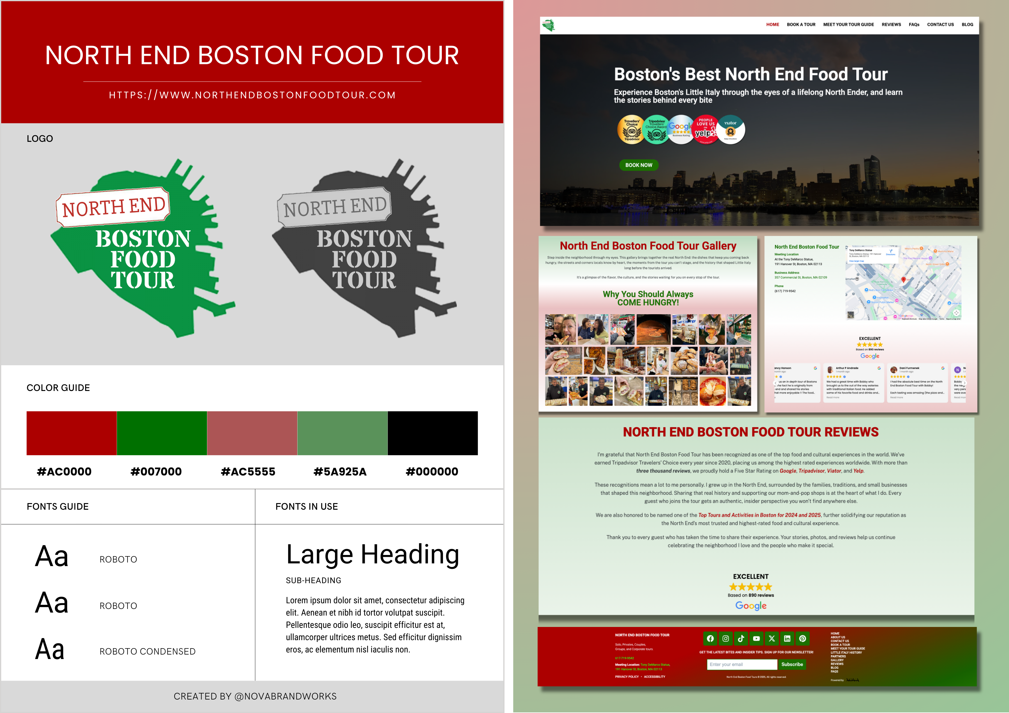
North End Boston Food Tour needed a website that clearly communicated the value of the experience while guiding visitors smoothly toward booking. The goal was to design a modern, story-driven site that felt authentic to the North End, worked seamlessly on mobile, and removed friction from the decision-making process. This project focused exclusively on user experience, visual hierarchy, and conversion-ready design.
This project is for a local tourism business with the primary goal of increasing bookings. The website will be built on WordPress with a seven-week timeline, and the scope of work includes UX and UI design, visual design, and copywriting to support conversion and user engagement.
The previous website did not reflect the personality, credibility, or local authority behind the brand. Visitors were required to work too hard to understand what the tour included, why it was different, and what to do next. Key challenges included unclear hierarchy, an underwhelming mobile experience, and a booking flow that was not immediately obvious to first-time visitors. The challenge was not attracting interest, but sustaining it long enough to convert.
The design strategy centered on clarity, restraint, and storytelling. Every element was intentional, from page structure to typography, ensuring users could quickly understand the offering without being overwhelmed. We designed a clear narrative flow that introduced the brand, established trust, highlighted the experience, and naturally guided users toward booking. Visual choices were kept clean and confident, allowing photography and copy to do the heavy lifting rather than unnecessary effects or distractions.
The redesigned website delivers a clearer first impression, a smoother browsing experience, and a more confident booking journey. The brand now feels cohesive, modern, and aligned with the quality of the tour itself. This project established a strong design foundation that can be expanded with future SEO and growth initiatives.
